


In 2012, the web design industry got serious about design for mobiles. According to Walker Sands, in Q1 2013 almost 24% of web traffic is now from mobile devices.
Some in this industry expect that in 2013, the percentage of web traffic from a mobile device will exceed 50%. That sounds like a tall order, until you look around on the street, on public transport, and you realise that many people spend most of their time glued to a mobile device.
It changes little when they get home; they settle down on the couch switch to a tablet for evening surfing.
The quick jargon dictionary
There is one word you really need to know about - responsive. If you want to impress your colleagues, talk to them about “responsive websites”.
What does that mean? To put it simply, a responsive website is one which is capable of altering its appearance according to what device it is being viewed on.
There are a couple of other words worth knowing about:
- fixed width: to describe how most websites have been built until now (the width of the page is fixed in pixels); and
- fluid: to describe a site whose width changes in proportion to the window
Inventions, inventions
The days of Internet Explorer being the only browser to care about are long gone. Every new smart phone and tablet that we see has new characteristics.
So we need a new way of thinking about browsers, and with that, the way we design sites.
Responsive sites are a way of dealing with that constant change.
Do we really need responsive design?
Yes! This is not just an academic exercise. We need it. And more importantly, it’s a new way of thinking.
When I look around the internet at “traditional sites” some things make me shiver. Take this one that I came across last week, viewed on an iPad:

Yes, it’s a company home page! The text is far too small to read, and the Flash-based animation that works on some browsers completely fails to appear.
But your site would never make those mistakes, right?
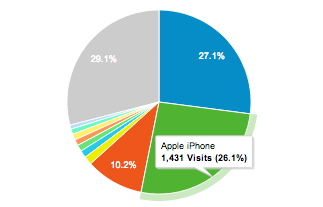
Look at your site on a tablet, on your phone. Do you like what you see? Then look at your traffic – I’ll bet you at least 10% of your traffic is from smart phones and tablets. Perhaps a lot more.
But people just pinch and zoom to get around…right?
Right… to a point. Remember that if your site’s text is a bit on the small side, users will need to zoom in a long way in order to read it. They may feel like doing that for a slab of content in the centre of the page, but incidental text may get completely missed.
But more worryingly, if you’re thinking “we can get away with it”, it won’t be long until your competitors cotton on, that there is a chance to gain an advantage here.
To be fair the percentages quoted above may not apply to you. They differ between industries, and between different audiences. But you do need to understand how your audience behaves, whether from traffic analysis or from a more detailed study.
So here are the essential things you need to know…
1. What is special about mobile devices?
On a mobile device, a number of things are different from a regular desktop, here are the fundamental ones:
- there’s no mouse, but a touchscreen
- the screen is smaller
- connections are often slower, so downloading web pages may take longer
- Flash may not be supported.
A well-designed responsive site will take these factors into account.
2. Mobile screens are smaller and have no mouse
When designing for mobile, we take into account the smaller screen size. It’s possible to make the size of a web page compress to suit the width of a tablet by making it fluid. That just means the width of its columns and overall size compress to suit the screen.
It’s common to preserve text size when viewed on a smaller device – so the user shouldn’t need to zoom in. Pages may grow taller but that is okay as it’s easy for users to scroll vertically.
For phones as opposed to tablets, designers make pages responsive. That means the various areas of a page can have a different layout when viewed on a mobile.
With responsive design, less essential things need to be turned off altogether; perhaps a non-critical image, or some material that is better found elsewhere on your website.
3. Pay special attention to navigation
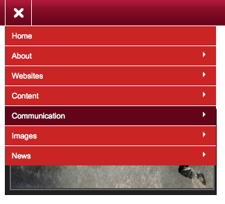
Wide menus simply don’t work on small screens, so a decent responsive site will cause menus to change their appearance and location on the screen. This just isn’t going to work on a mobile:

A common technique is a “hamburger” menu, a single button which the user clicks in order to reveal the menu navigation, so on a small screen the user would see this:
When the device has no mouse, it’s hard to rely on a hover state. If your site relies on a hover state (e.g. giving text an underline), you need to re-assess. The working of menus, hyperlinks and buttons in general needs to be reconsidered, so that users can use them comfortably on a touchscreen.
Your responsive site may even introduce new types of navigation; some more advanced mobile sites have swipe control, so that a user can just swipe sideways to go to a different part of the site.
4. Be smart with images
We’ve got used to lovely big images on our sites these days, even dynamic slideshows and movies; but on a mobile we need to take care. The download time of a large image can be prohibitive, and anyway it would be wasteful to fill a whole mobile screen with one image.
Consider this masthead:

If we simply scaled down the image it would suit the screen, but it would lose impact. So it’s better to be a little smarter, so that to a mobile device we provide not only a smaller image but a slightly different one:

The tech behind the responsive site should ensure that the image downloaded to the user’s mobile is appropriate. That not only means it should display at a smaller size, but also that the image downloaded is no bigger than that which needs to be displayed.
5. Forms and other tools
Some things need particular attention, such as forms. A contact form may be the most critical thing on a brochure website, so it needs to work as nicely on a mobile as on a large screen.

Phone numbers too deserve attention. Get the number format right, and with a single click a user can call you; get it wrong, and he’ll have to re-type it into his phone, or worse still call the number his phone thinks it sees and get a “unobtainable”.
6. Maps
Get your mapping working nicely (so that people can find you!). Your website may well have a map already, but make sure a user can easily switch to using the mobile device’s native mapping tool:
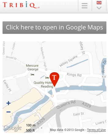
Then your visitor can use mobile tools like Google’s directions:

7. Stay responsive
It probably goes without saying, but you should make sure you are aware of how your site looks – if you’ve not got a smart phone or tablet, get one.
Mobile trends are going to keep changing. If you’re not following these trends yourself that is excusable, but keep chasing your web designer to ensure he or she is up to date.
Recent posts
Re-design of website for Mortgage Required
22 Aug 2023
New site launched for Salecology
12 Jul 2023
New design for International Camellia Society
20 Jan 2023
How to migrate your Analytics to Google’s GA4
30 Sep 2022
New design for Institute of Refrigeration
11 Mar 2022
Brexit and .eu domain names
29 Aug 2018
GDPR and your website
26 Feb 2018