


The Chiltern Way Federation is a specialist secondary school for boys and girls with social, emotional, communication and interaction difficulties.
Collaborating with our partner Supreme Creative, we were tasked with building a simple, easy to navigate website where information about the school can be found easily by site visitors.
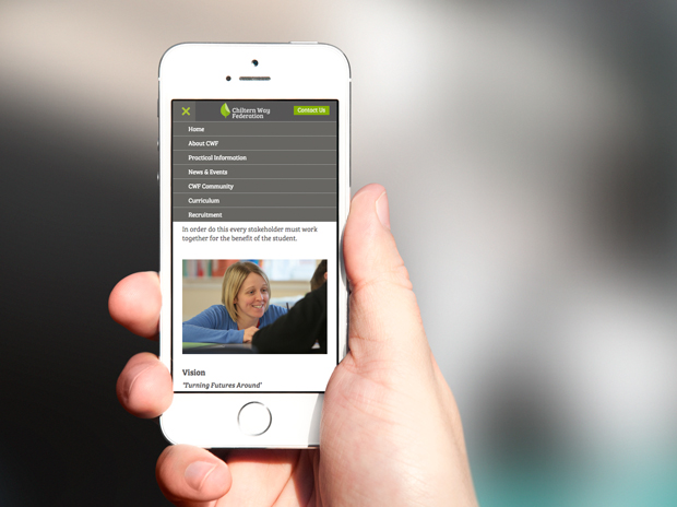
Responsive design
When constructing a responsive website it is important to consider how the website will react when viewed on various devices and screen sizes. Certain features of a web page can be optimised for smaller screens, for example a responsive menu is used so that visitors on a touch screen device can navigate the site effectively.
Media gallery
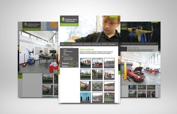
One of the key elements that CWF wanted to emphasise was the fact that no stock images were used on the site. The photos used were specially commissioned by Supreme Creative and professionally taken making for a powerful statement when viewed on the website.
To portray these images in the best way possible a media gallery was created that showcases the various buildings, staff and facilities that each campus provides.
When an image is clicked it opens in a pop-up window where the images can be seen at full size. These content managed images will display in a consistent size and style when uploaded to the gallery.
If you would like to see the site in action, you can view the website here.
Recent posts
Zenario 10.0 announced
22 Jul 2024
Re-design of website for Mortgage Required
22 Aug 2023
New site launched for Salecology
12 Jul 2023
New design for International Camellia Society
20 Jan 2023
How to migrate your Analytics to Google’s GA4
30 Sep 2022